
Here’s some ideas to design great looking labels with impact and that extra ‘wow’ factor
Designing Great Labels
Getting a great looking label means having a clear idea of the message you want to send. Here’s a few tips to think about.
Simple is Best
Simple labels are usually the most successful, so don’t complicate the message or design.
Don’t Overcrowd the Label
Too much detail makes the label confusing and difficult to print. When designing the label, try both “landscape” and “portrait” formats to get the best result. You could try putting the type around the edge to free up centre space for a logo.
Colour
Use colours that attract attention and work together. Think about the produce colour and what will suit it. Brighter colours often work better on labels and give a strong effect and greater visibility. The maximum number of colours we can print on the label is five, but by using tints and overlays the impression of extra colours can be achieved.
Pantone Colours
We use Pantone colours ending in ‘C’ (which stands for coated) when printing our Sinclair labels. It’s important to quote the Pantone number to get a colour match. If a particular colour is unavailable we’ll match it to the closest Pantone possible if you supply us with a colour sample.
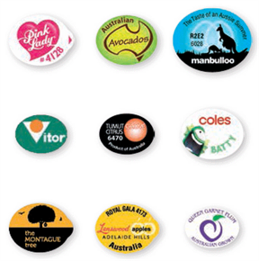
Label Shape
Most labels are ellipses or circles, but that doesn’t limit your options with proprietary shaped labels. Regardless of the shape you choose, always try to get the best out of your label design by limiting word length and logo positions. And, we recommend using TABLIFT™ labels for all edible skin fruit and vegetables.
Type Size
To make sure you get the best out of your labels, we recommend using 5pt type as a minimum size, any smaller and it won’t print successfully. If you’re wanting to reverse the type (eg. light on a darker background) then the minimum type size should be at least 6pt and preferably used as a bold typeface.
Typefaces
When designing your label, always check it at actual size to make sure it can be read easily. As a general rule, ornate typefaces will need to be larger, and smaller type works better as a sans serif typeface. Make sure important information like PLU numbers and variety names are clear.
Borders
If you want a border to bleed off the edge of your label, it will need to be at least 1mm thick to make sure it stays in register during printing. And, any object or image on the label should be at least 1mm away from the edge to maintain printing consistency.
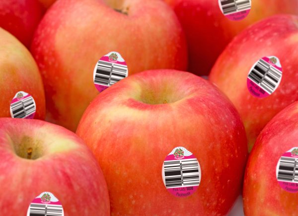
PLU Numbers
The ideal type size for PLU numbers is 14pt. If this is difficult to achieve on a small label then the minimum size is 10pt. If adding the # sign, it can be slightly smaller than the PLU number.
Databar
The minimum dimension of a stacked Databar at 100% should be 8mm. It needs to have a white background and a PLU number on the label to meet scan-ability and GS1 guidelines.
Enquire Now
-
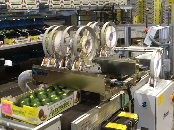
Sinclair CR4 – Tray Labelling
The CR4 is a gentle and precise pattern labeller for produce in trays, punnets or liners. It labels up…
Read more -
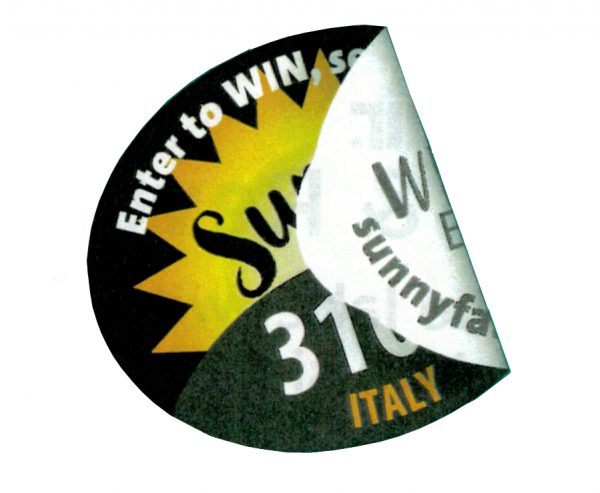
Peel & Reveal
Here’s a unique idea - the label with two sides. Peel & Reveal labels are printed on both sides…
Read more -
GS1 Databar
It’s more than just a barcode. The GS1 Databar carries much more information than ever before, so to help you…
Read more
